Vienna U-Bahn Ridership Visualization
Exploring Transit Patterns Through Interactive Design
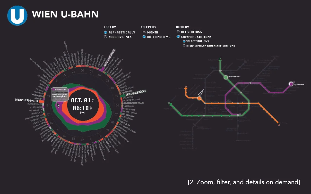
This interactive data visualization explores ridership patterns across Vienna’s U-Bahn subway network over the course of a month. Developed as part of a graduate-level data visualization course at Northeastern University, the project responds to Ben Shneiderman’s “Visual Information-Seeking Mantra” and is structured around three core principles: Overview, Zoom & Filter, and Relate.
The interface offers a radial timeline showing ridership variations by station and hour, allowing users to identify peak usage periods. Integrated with a live subway map, users can filter by line or station, compare rush hours, and discover which stations share similar ridership profiles. This visualization blends spatial geography with temporal insights, transforming dense datasets into a navigable, decision-support tool for public transit analysis.


What Worked Well
Clear structure aligned with user tasks
Each view mapped directly to Shneiderman’s mantra—Overview, Zoom & Filter, and Relate—keeping interaction logic focused and functional.Consistent radial layout across all views
Using a circular design throughout gave the interface strong visual identity and improved user orientation across modes.Effective color-coding by subway line
Matching data segments and station labels to Vienna’s U-Bahn color scheme helped users connect abstract data to real-world geography.Dual-panel design: data + map
Combining radial data views with a schematic map grounded the experience in both time and space, enhancing interpretability.Integrated tooltips and timestamp filters
On-hover details supported user agency without cluttering the main view, aligning well with “details-on-demand.”
What I Would Improve Today
Radial layout gets dense
With too many data layers, clarity suffers. I’d add toggles for lines or consider a linear timeline view for better comparison.Visual accessibility needs work
Neon-on-black is bold but not legible for all users. I’d improve contrast, offer a light mode, and use colorblind-safe palettes.Static mockups limit experience
I’d prototype interactivity using Figma or D3 to show transitions, filtering, and real-time behavior.Fixed similarity in “Relate” view
The comparison logic was static. A dynamic slider would let users define what counts as “similar,” supporting exploration.Missing guidance or legend
The interface could benefit from small onboarding hints or a mini legend to help first-time users navigate more easily.